Have a question about this article or want to learn more?
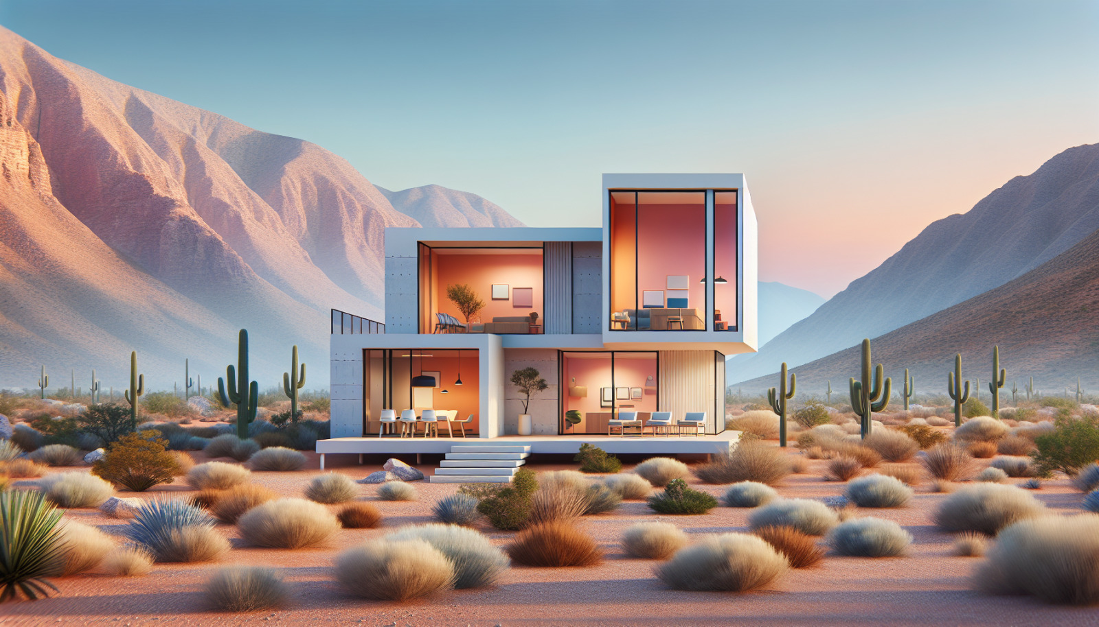
When buyers scroll through listings in Boulder City, Nevada—nestled between Lake Mead, the River Mountains, and the Hoover Dam—paint color is one of the first cues they use to decide whether a home “feels right.” The right palette can make rooms look larger, reinforce natural light, harmonize with desert views, and photograph beautifully. The wrong one can make a spacious living room feel cramped or cast an odd tint in listing photos.
In Boulder City’s intense sunshine and arid climate, colors also behave differently than they do in coastal or forested markets. High UV levels can fade saturated hues outdoors, and warm desert light can pull out yellow or pink undertones inside. That’s why local nuance matters. A strategic paint plan—especially one that accounts for stucco exteriors, tile roofs, and common interior finishes like travertine—can shorten days on market and increase perceived value.
As a Boulder City specialist, Josh Towers helps sellers choose colors that resonate with the area’s buyer pool: outdoor enthusiasts, second-home owners, and move-up buyers who appreciate the small-town feel with quick access to Henderson and Las Vegas. Josh’s guidance prioritizes broad appeal, photo readiness, and compatibility with Boulder City’s architecture—from Hoover Dam–era cottages near the Historic District around Arizona Street to newer stucco homes near Boulder Creek Golf Club.
Neutral doesn’t mean boring. In Boulder City, neutrals—think warm grays, soft beiges, greige, and creamy off-whites—work with the desert’s sandstone and sage palette. They make rooms read bigger and cleaner in online photos, and they let buyers mentally “place” their furniture and art.
A neutral canvas is essential in open-concept homes common around the golf course corridor: using one continuous, light neutral through living, dining, and hallways creates flow. Save deeper shades for accent walls only if they’re subtle and support the architecture. Loud statement colors can feel jarring and often photograph poorly. If you love bold hues, consider reserving them for removable décor rather than paint.
Undertones are everything in the desert. Sun-bathed rooms with south or west exposure will pull warm notes from even “pure” whites. Cool grays can read icy blue on bright days; warm whites can go yellow next to honey-oak cabinets. Test large swatches at different times of day to see how desert light changes them.
Undertones that work well locally: - Warm gray with a whisper of green or beige to echo sagebrush and soften glare. - Greige (gray-beige) to bridge older travertine tile and newer quartz counters. - Creamy off-whites with a soft taupe undertone that stay elegant without turning golden at midday.
Older cottages near the Historic District often shine with cozy warm neutrals that play nicely with original woodwork, while newer stucco homes can handle slightly cooler greiges that modernize flooring and granite patterns. If your home faces north or sits in the hillside shade, a warmer undertone prevents spaces from feeling flat.
Local micro-trends matter. Around Boulder Creek Golf Club, you’ll see cohesive exterior palettes dictated by HOAs: sand, tan, and greige bodies with crisp, warm-white trims and dark bronze accents. Near downtown’s historic streets, softer exterior neutrals that respect the period feel—like light adobe tones—tend to win buyer favor. Hillside homes with lake glimpses often lean into airy, soft interiors that let the views do the talking.
If you’re uncertain, Josh Towers reviews comparable listings in your price bracket to find palettes that are selling now. He also considers architectural style: Spanish Revival and Pueblo-inspired homes look natural in earthier exteriors with muted turquoise or chili-red front doors, while mid-century ranches often benefit from a modernized greige body with darker trim.
In our market, a middle path—greige—beats the pure gray vs. beige debate. Cool grays can feel sterile under Boulder City’s piercing sunlight, while traditional beiges can skew yellow next to white cabinetry and contemporary furnishings. Warm grays and greiges strike the balance, providing modern freshness without coldness.
Why warm gray works here: - It flatters both older tile (travertine, tumbled stone) and newer LVP or engineered wood in oak tones. - It keeps listing photos crisp and consistent despite changing daylight. - It supports a variety of furniture woods and metals, from oil-rubbed bronze to brushed nickel.
Top color families Josh sees performing well in living and dining areas: - Light Greige: Comparable to “Edgecomb Gray” or “Agreeable Gray.” - Soft Warm Gray: Similar to “Repose Gray” or “Classic Gray.” - Creamy Off-White: In the vein of “White Dove” or “Swiss Coffee” for homes with abundant natural light. - Gentle Taupe: A barely-there taupe that neutralizes glare without reading brown.
For ceilings and trim, choose a warmer soft white rather than a stark blue-white; it feels more inviting and avoids harsh contrast in bright rooms.
Kitchens are focal points for Boulder City buyers—especially those who entertain after a day on Lake Mead. Keep walls consistent with your common areas to maintain flow. Use sheen strategically: eggshell on walls for easy wipe-down, satin or semi-gloss on trim.
Add dimension with: - A subtly deeper shade on an island to ground the space. - A soft, muted green-gray accent if your view includes greenery or if you want a nod to the desert’s sage palette. - Warm, creamy walls to balance cooler quartz or stainless appliances.
Cabinet painting is a high-ROI update. Crisp white cabinets are safe and photograph beautifully. If you want a bit of personality without risk: - Two-tone: White uppers with a light greige or deep charcoal base. - Soft sage or eucalyptus green: A refined, regional nod that still reads neutral. - Mushroom taupe: Works with beige stone counters common in many Boulder City kitchens.
Choose durable cabinet enamel and a professional spray finish for the smoothest result. Update hardware to matte black or brushed nickel, depending on your appliance package.
Bedrooms should feel restful. Desert evenings cool down quickly, and buyers want a calm retreat after time on the trails or water. Lighter tones tend to win: airy greige, warm off-white, or a whisper of gray with a green undertone.
For primary suites: - Keep it seamless with your main living color, or go one shade lighter for a luxe hotel feel. - If you have lake views or mountain vistas, keep walls light so the eye goes to the windows.
Secondary bedrooms: - Soft, versatile neutrals help buyers imagine guest rooms, nurseries, or offices without repainting. - If a room is small, stick to pale tones to maximize visual space.
Repainting bedrooms is one of the most cost-effective pre-listing upgrades. Fresh paint hides minor scuffs and makes carpet and flooring appear newer. To avoid missteps, Josh Towers offers in-person or virtual color consults, factoring in room orientation, flooring tone, and your listing strategy.
Bathrooms can handle a little personality, but keep resale top-of-mind. Use moisture-resistant paint in matte or satin to reduce glare and handle humidity.
If your bathroom features warm stone (travertine or tan tile common in Boulder City): - Pair with light greige or creamy whites to modernize without clashing. - Consider a muted spa green or blue-gray in small doses to freshen the space.
If your finishes are cooler (white subway tile, gray quartz): - Soft warm gray or off-white warms the room so it doesn’t feel clinical. - A very pale taupe adds coziness while staying neutral.
Reliable bathroom color families: - Spa Blue-Gray: Delicate and airy, ideal for small spaces. - Light Greige: A unifying choice across varying tile tones. - Creamy Warm White: Great for windowless baths to bounce light.
Finish trim in a slightly glossier warm white for easy cleaning and a crisp edge.
Curb appeal sets buyer expectations before they reach the door. In Boulder City’s sun-drenched climate, exterior colors must be UV-stable and compatible with stucco textures and tile or composition roofs. Lighter, earth-rooted bodies are safest—they reduce heat absorption and resist fade.
What works outdoors here: - Desert Neutrals: Sand, putty, and soft greige feel right at home with xeriscaping, native plants, and rock mulch. - Warm Whites: Creamy off-whites on stucco read elegant and timeless, especially with terracotta roof tiles. - Sage and Dusty Olive: Subtle greens that echo the landscape without looking too bold.
HOAs near golf course communities often provide preferred palettes; sticking to those ensures a smoother approval process and broader buyer appeal. In older neighborhoods, respect the street’s character: a subdued exterior with historically sympathetic trim is both timeless and market-savvy.
Front doors are a smart place for personality: - Deep Teal or Muted Turquoise: A sophisticated nod to Lake Mead. - Chili Red or Terracotta: Warm, inviting, and regionally appropriate for Spanish and Pueblo-inspired homes. - Charcoal or Bronze: Sleek and modern for newer builds.
Specific exterior combinations that perform well in Boulder City: - Body: Soft Greige; Trim: Warm White; Accents: Dark Bronze. Works with both tile and composition shingle roofs. - Body: Light Sand; Trim: Cream; Door: Muted Turquoise. Classic Southwest personality with broad appeal. - Body: Warm Off-White; Trim: Taupe; Garage: Match Body; Door: Charcoal. Clean, upscale, and photo-friendly. - Body: Dusty Sage; Trim: Light Beige; Door: Natural Wood Stain. Ties into desert landscaping beautifully.
Pro exterior tips for our climate: - Use high-quality, UV-resistant coatings; consider elastomeric paint on stucco to bridge hairline cracks. - Test colors in morning and late afternoon sun; the same swatch can shift dramatically. - Keep garage doors either body color (to downplay) or trim color (to highlight architectural detail). In most cases, matching the body makes the facade feel calmer.
How Josh Towers Maximizes Your Paint Investment: - Neighborhood-Centric Advice: Josh evaluates what’s selling now in your micro-area—golf course-adjacent, hillside, or historic streets—and tailors palettes accordingly. - Pre-Listing Color Consult: Josh walks through your home, assesses lighting, finishes, and photography angles, and recommends a unified scheme to carry through the listing. - Trusted Local Pros: From cabinet refinishers to exterior crews experienced with stucco and HOA approvals, Josh connects you with vendors who know Boulder City’s standards. - Staging and Photos: The right paint is only half the battle. Josh coordinates staging touches and photography that bring your new palette to life online.
Final Word: In Boulder City, Nevada, the best paint colors don’t shout—they harmonize. They respect the desert’s light, complement stucco textures and tile roofs, and create calm, inviting interiors that stand out in listing photos. Whether you’re refreshing a historic bungalow near Arizona Street or a contemporary home near the fairways, the right palette can be the difference between a showing and a sale.
For a custom, room-by-room color plan tailored to your property, schedule a walk-through with Josh Towers. You’ll get locally informed recommendations and a prioritized action list that keeps your budget focused on colors and finishes that measurably elevate buyer appeal. Visit Josh Towers at josh-towers.sellforonerealty.com to get started.
Keep reading other bits of knowledge from our team.